WELCOME
1
Information Architecture or “The Bones”
Gmail’s information architecture it is huge and unnecessarily complicate.
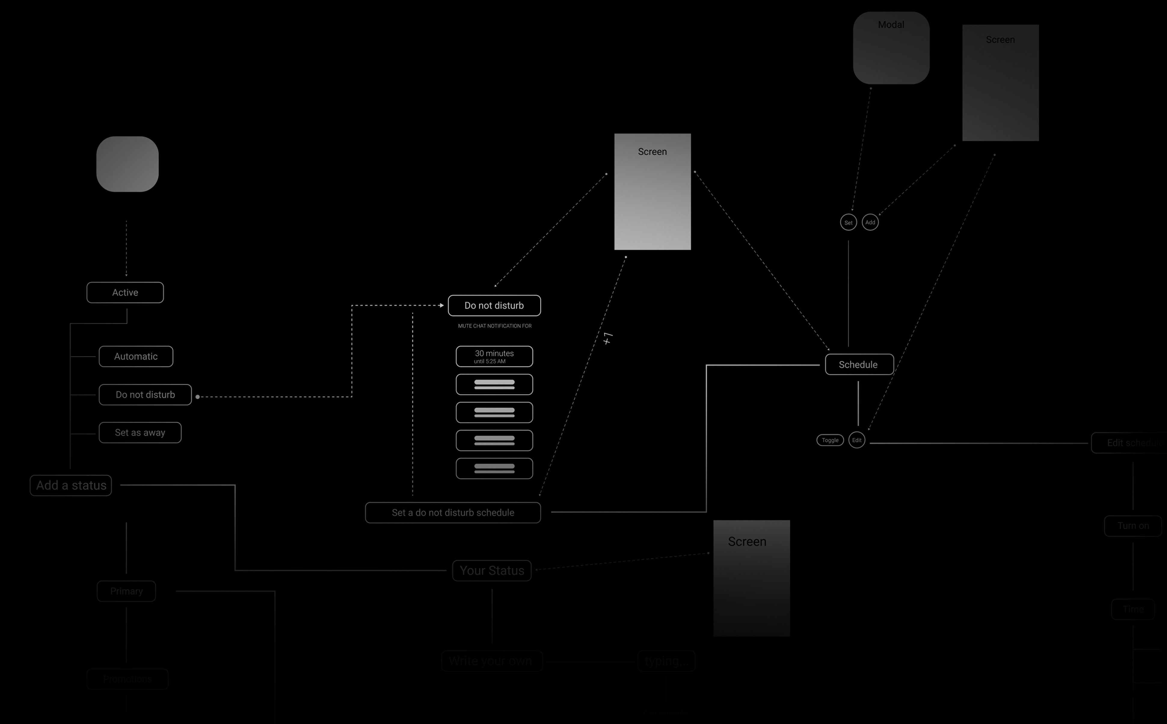
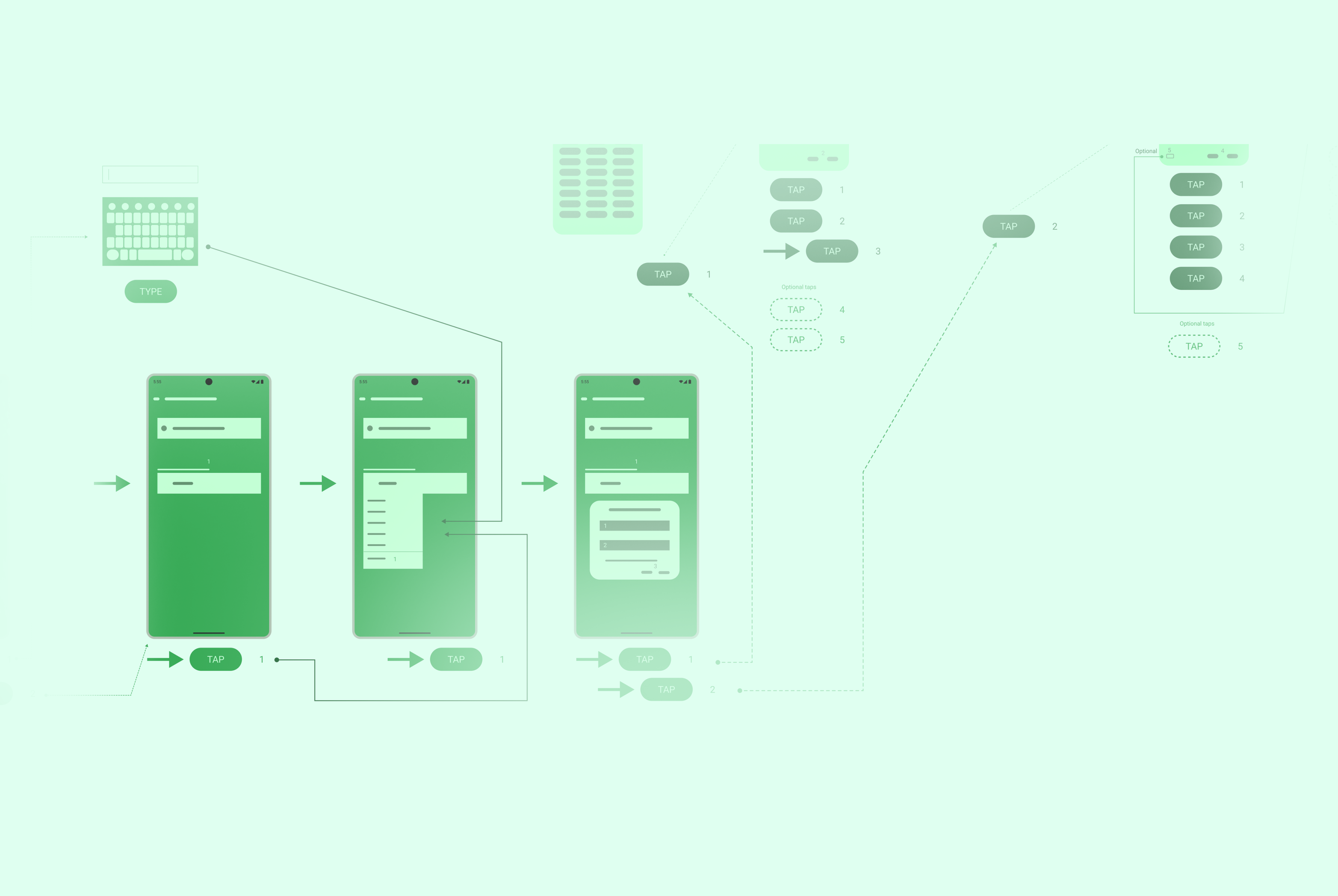
Click to view Gmail’s user flow.
“Google Gmail redesign it is challenging and rewarding, like a good-hard Fatal Fantasy fight.”
REDO
2
Here you can see a small part of the 67 Gmail screens, with original icons, real information, not lore ipsum bloblish bloblish.
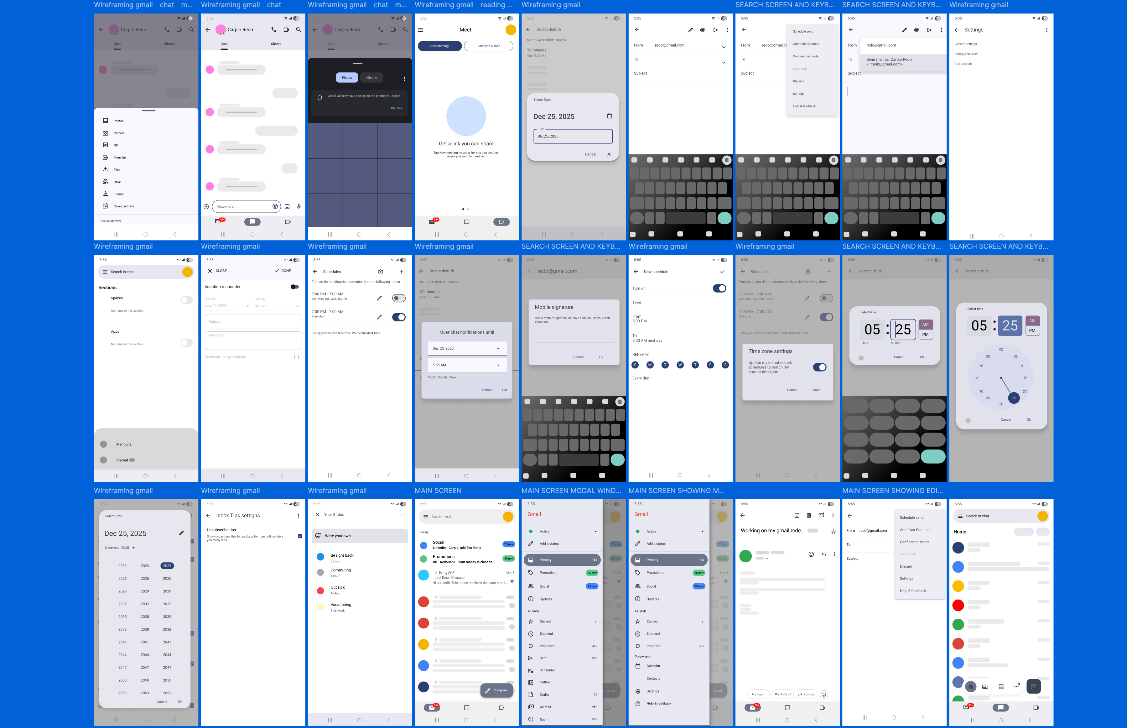
This was a huge task, I recreated every single screen and modal window, I typed every word and sentence, but why? I do not know, was hard and fun. I mean, I wanted to know what Gmail is about, why does it exist? every corner of it, every menu and its purpose, why every little thing just exist? and then, just then, start my redesign journey.
0
A little bit of history.
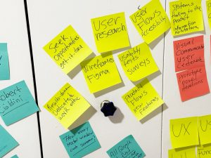
“A love gmail since its apparition 23 years ago, I’ve been using it, loving it, hating it.” I’ve recently finished my Google UX Design Professional Certificate and the next question was: What should I build? They recommended 3-5 projects, but that did not sound convincing to me. I wanted something more challenging and exciting…
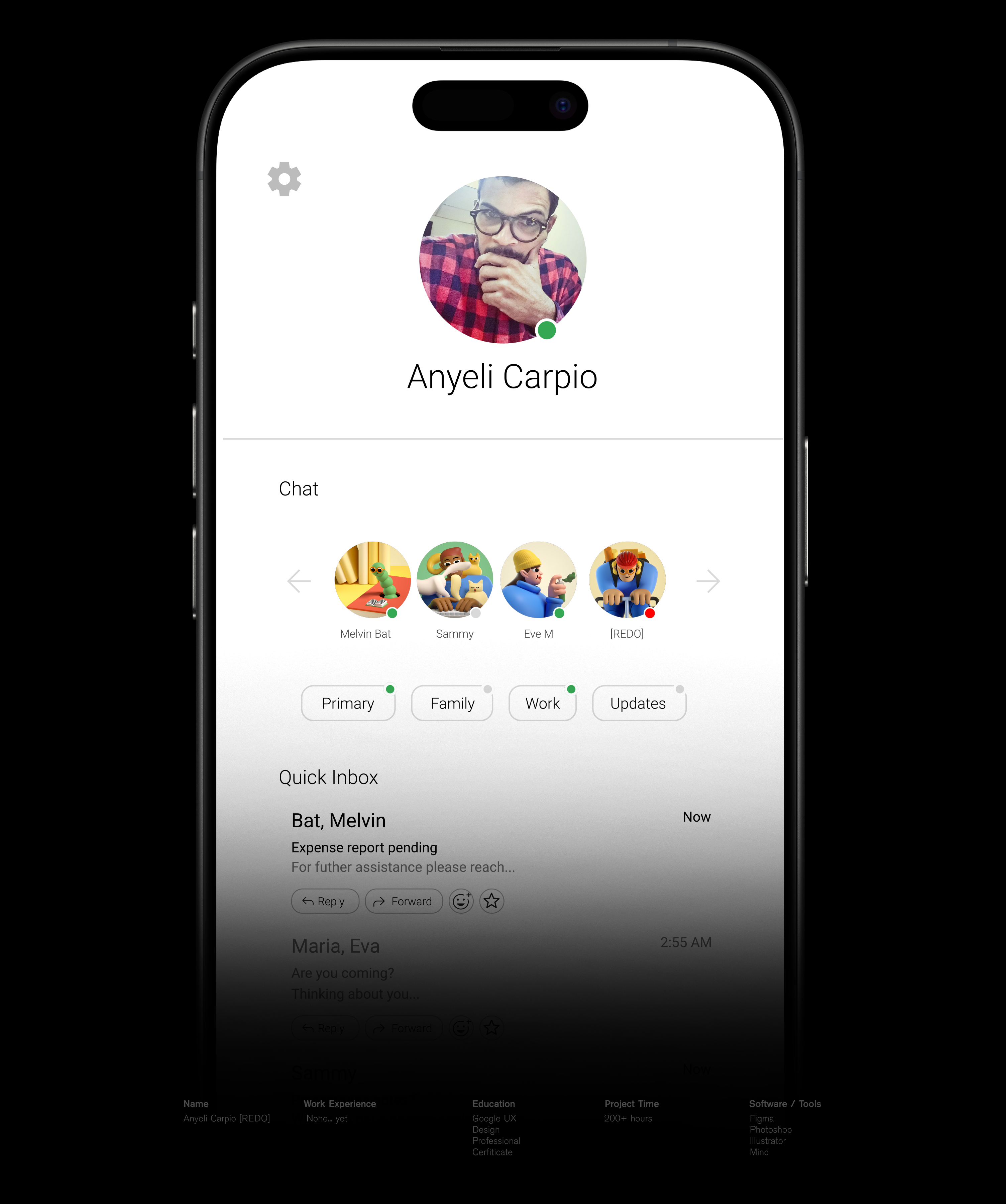
And then the crazy idea popped up, “I want to redesign Gmail”, but actually was more than that, my idea was to build “my perfect Gmail, apply my ideas and features, to make an App joyful and modern.” I will share my journey, pain, tears, frustrations, joy, this is an obsession, this is my lifelong project.
3
The long way to Status valley.
“After the general blueprint, I divided the Information Architecture in three big zones or (mini blueprint): Yellow zone: Do not disturb, Green zone: Add status and Red zone: All settings. Instead of tackle the whole thing, I will work with every mini blueprint separately, let’s start with the yellow zone.”
REDO
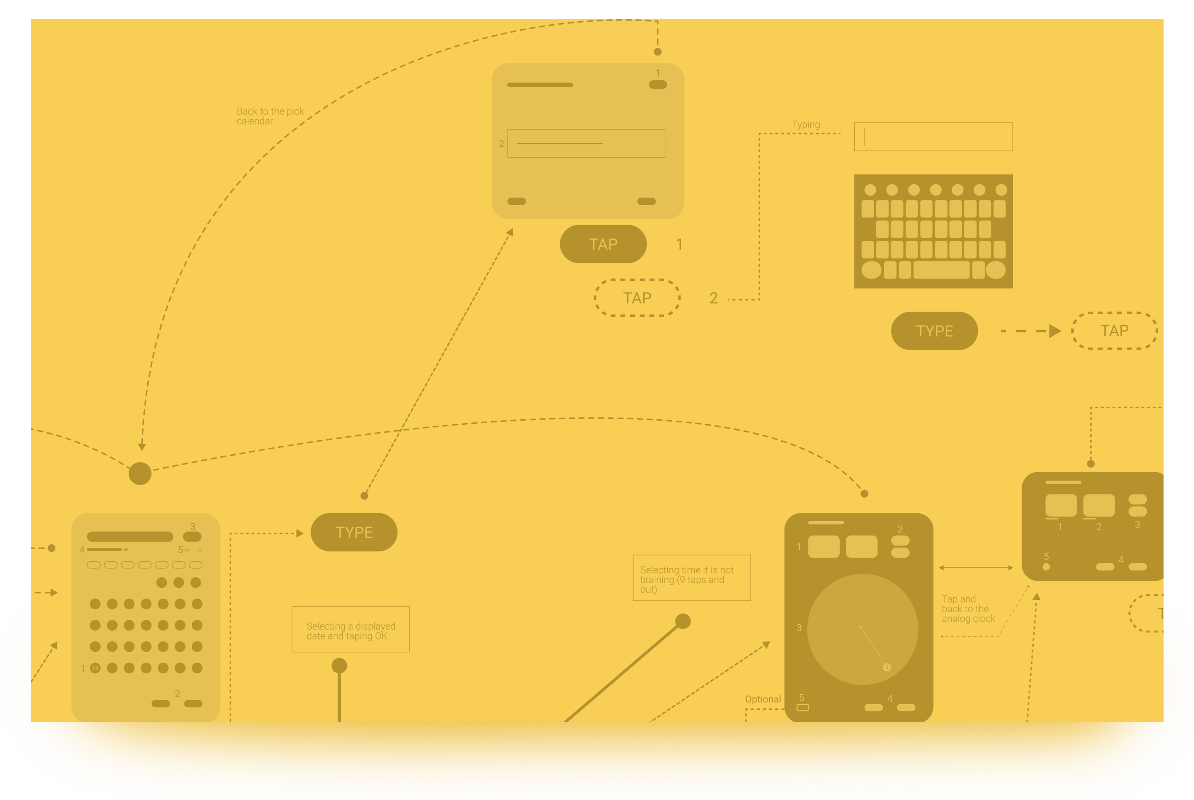
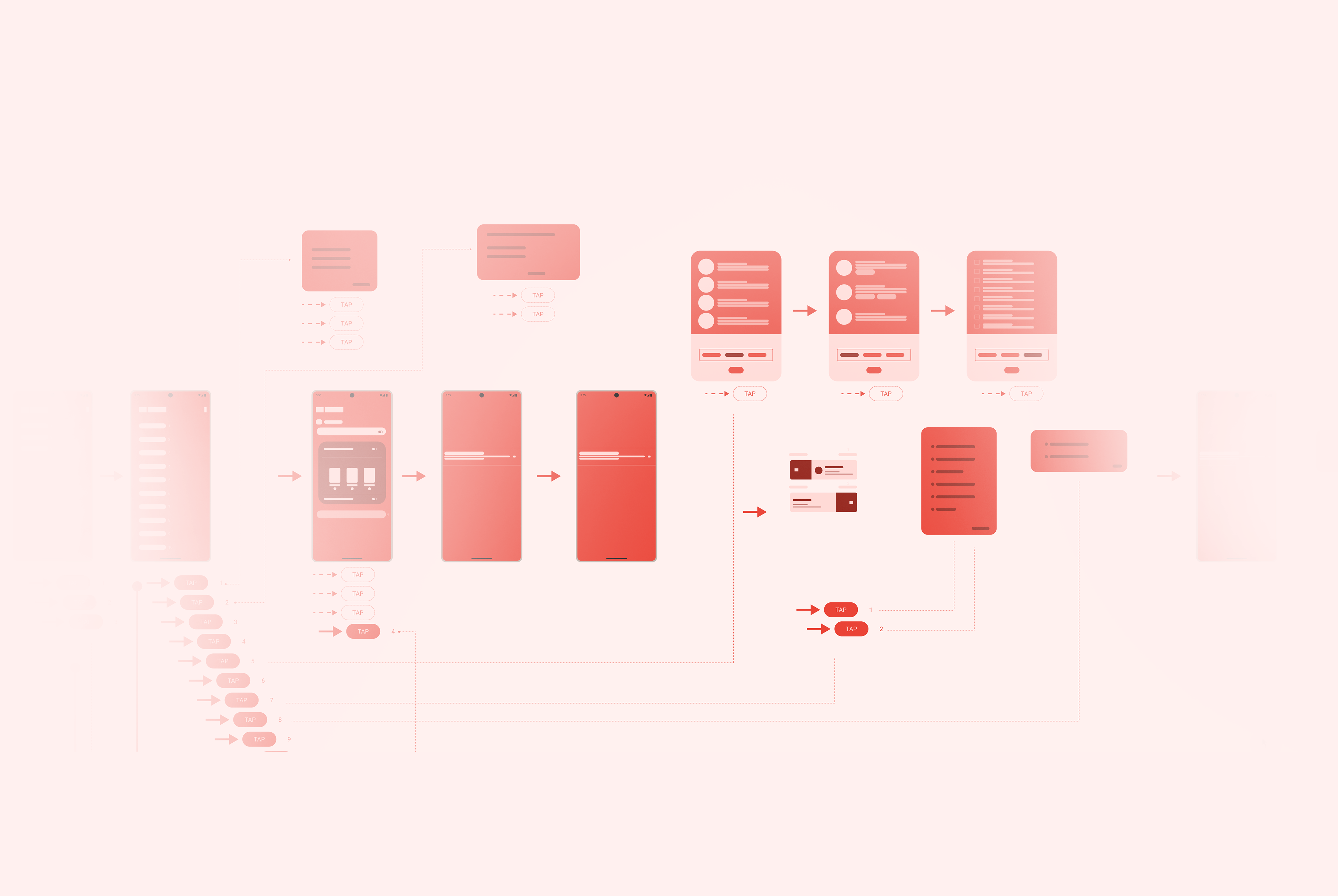
Click to view full Information Architecture.
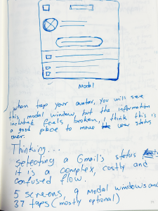
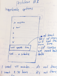
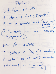
This is the flow to configure Do not disturb. It is divided in three main parts 1. Predetermined time 2. Select a specific time or 3. Set a do not disturb schedule. A total of 4 screens, 9 modal window, 26 mandatory taps and 18 optional taps.
Asking questions?
Why this user flow is too long?
Can we remove it?
Why it is located here? Can we relocated it?
Can we reduce taping and typing?
It is this feature necessary at all?
What will it be affected by it?
The location.
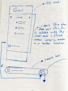
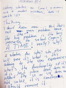
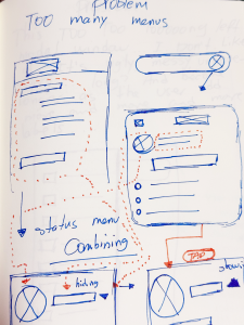
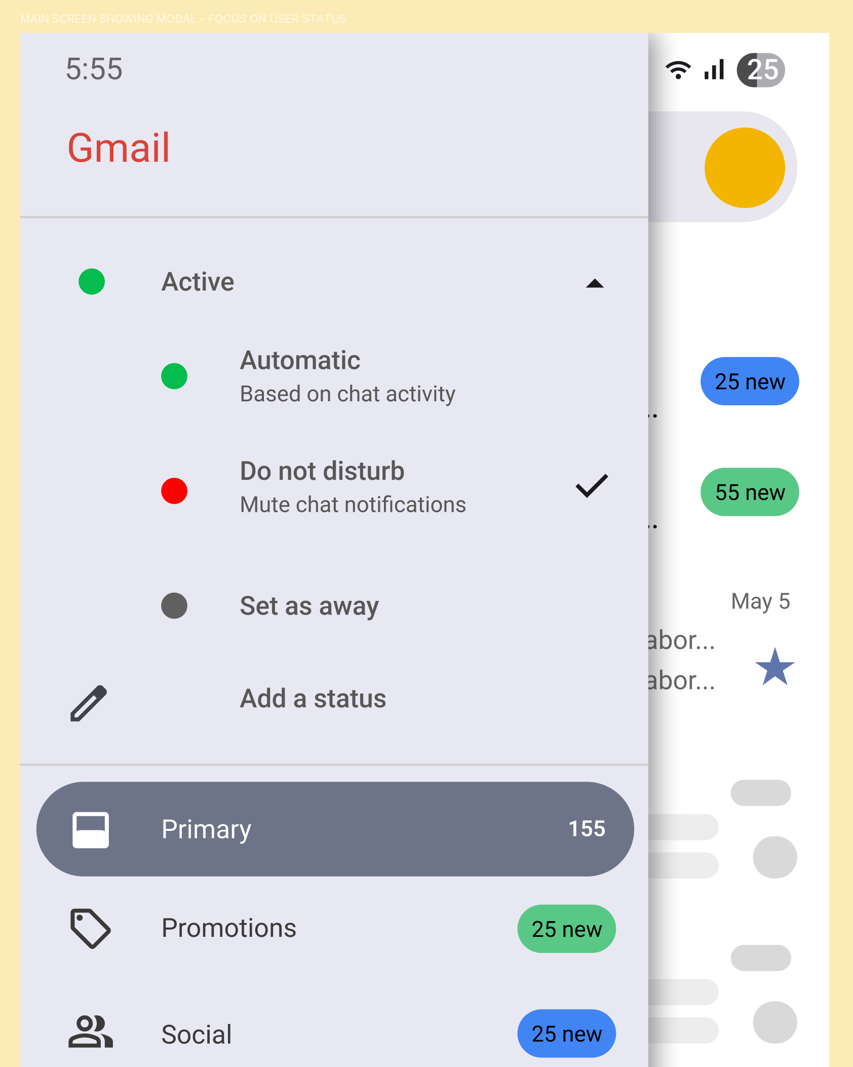
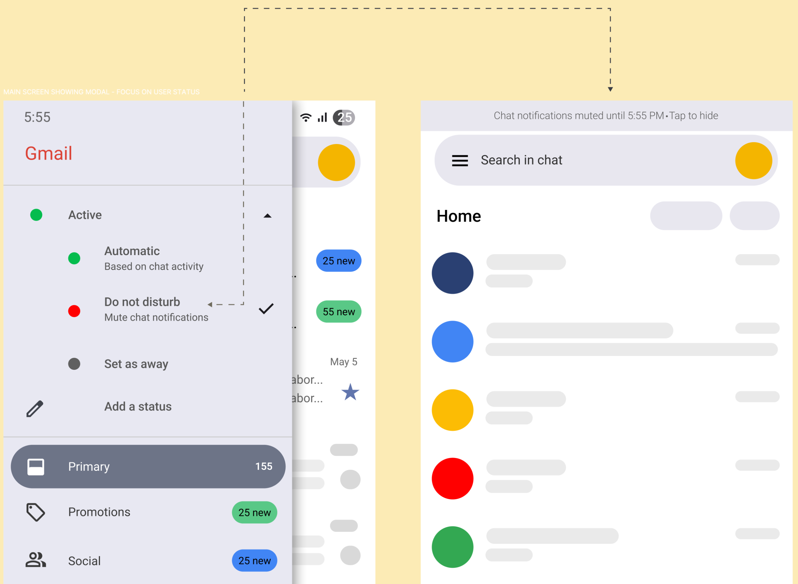
A big question: Why the status menu is located here? It feels disconnected and confused, it is also hard to deduce its truly functional being.
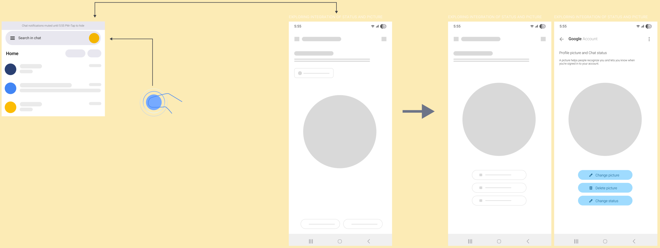
Solutions: 1. Remove Active menu from the main modal window to the Chat section. 2. Integrate the Active menu options into the Profile picture menu. “I like this because now Status and Chat are closed, that will reduce user confusion and it is now clear who is doing what.”
What’s my status?
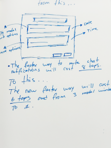
After you choose your status you will see this message: Chat notifications muted until [enter your time] Tap to hide, few issues with this: 1. It will blend with the whole chat because it has the same color. 2. If tapping by error there’s not way or will be almost impossible to know what is my current status. 3. The profile picture won’t change, no indication [different color etc] 4. No status indication outside Gmail App. 5. Tap to hide, but no tap to cancel or change.
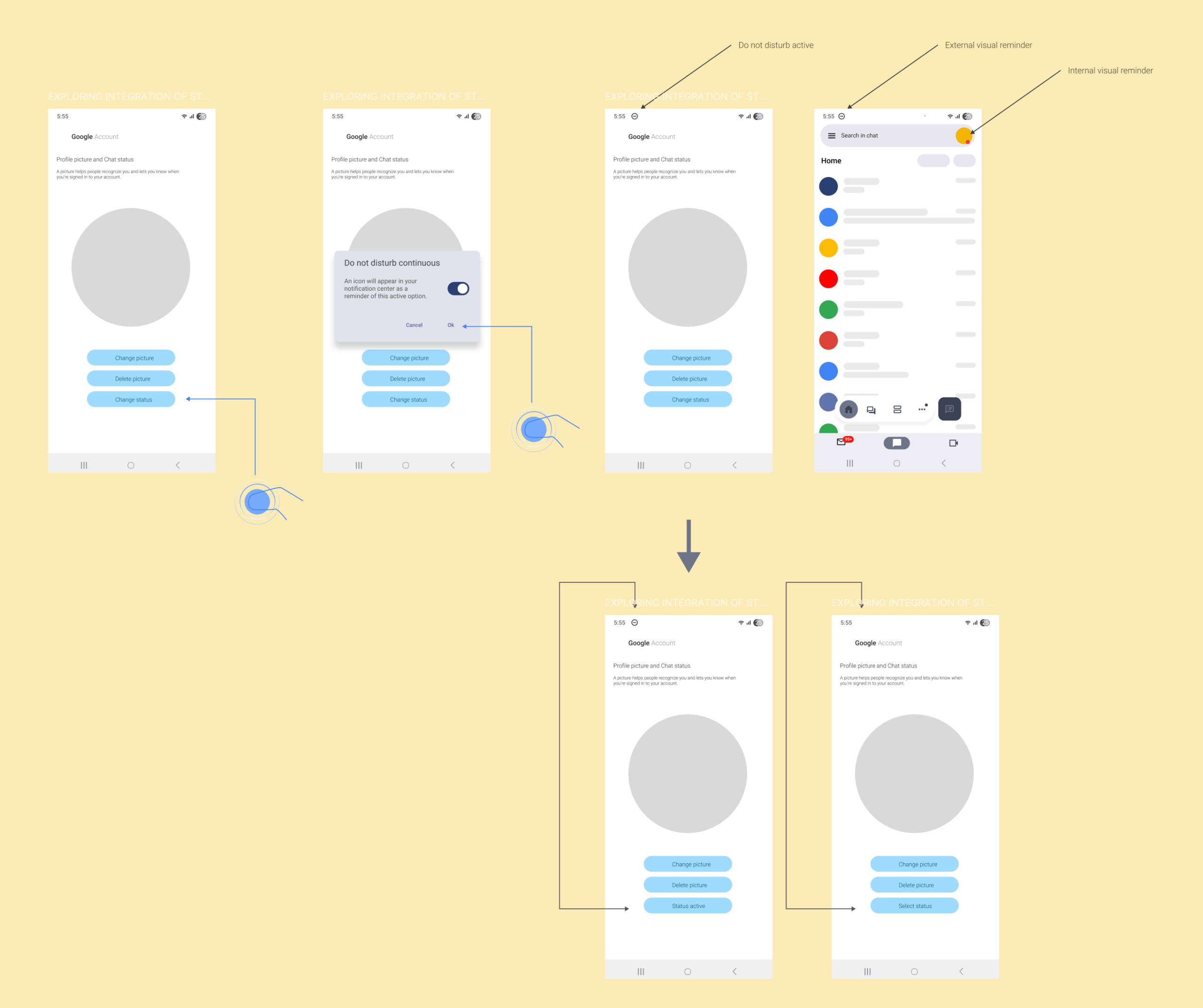
To make easy for the user, I want to offer as much clues as I can, there’s internal and external notifications and also a dynamic button to reminder the user if the status it is activated or not. I am not 100% satisfied with it, but it is a good start.
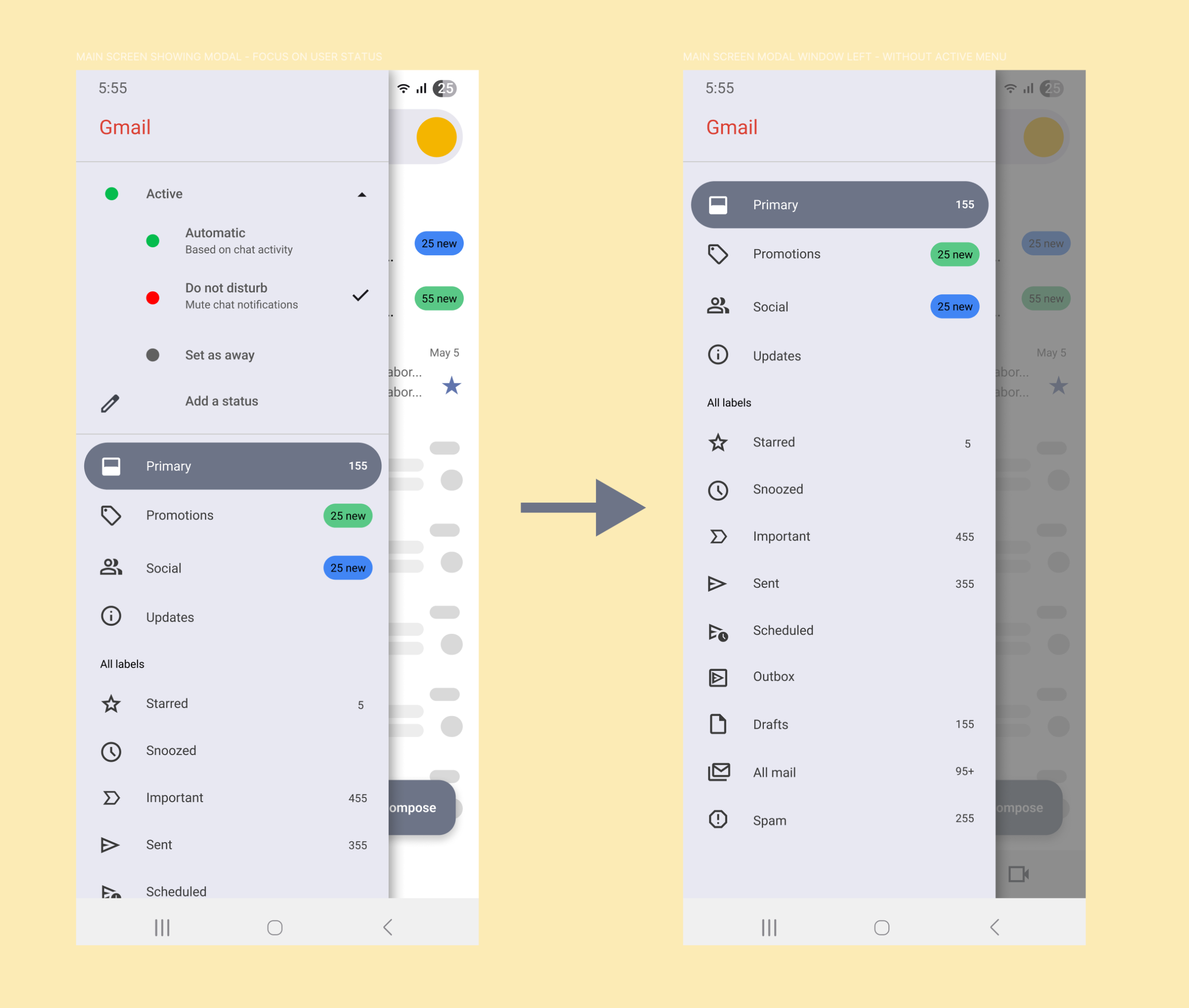
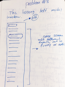
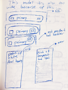
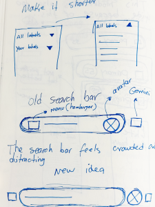
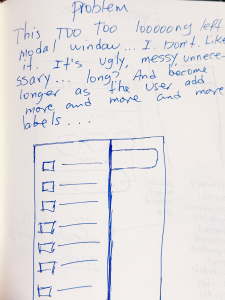
Now the visual aesthetic of Gmail is better organized and the modal window is way shorter.
Activating and deactivating the status from the Notification Center.
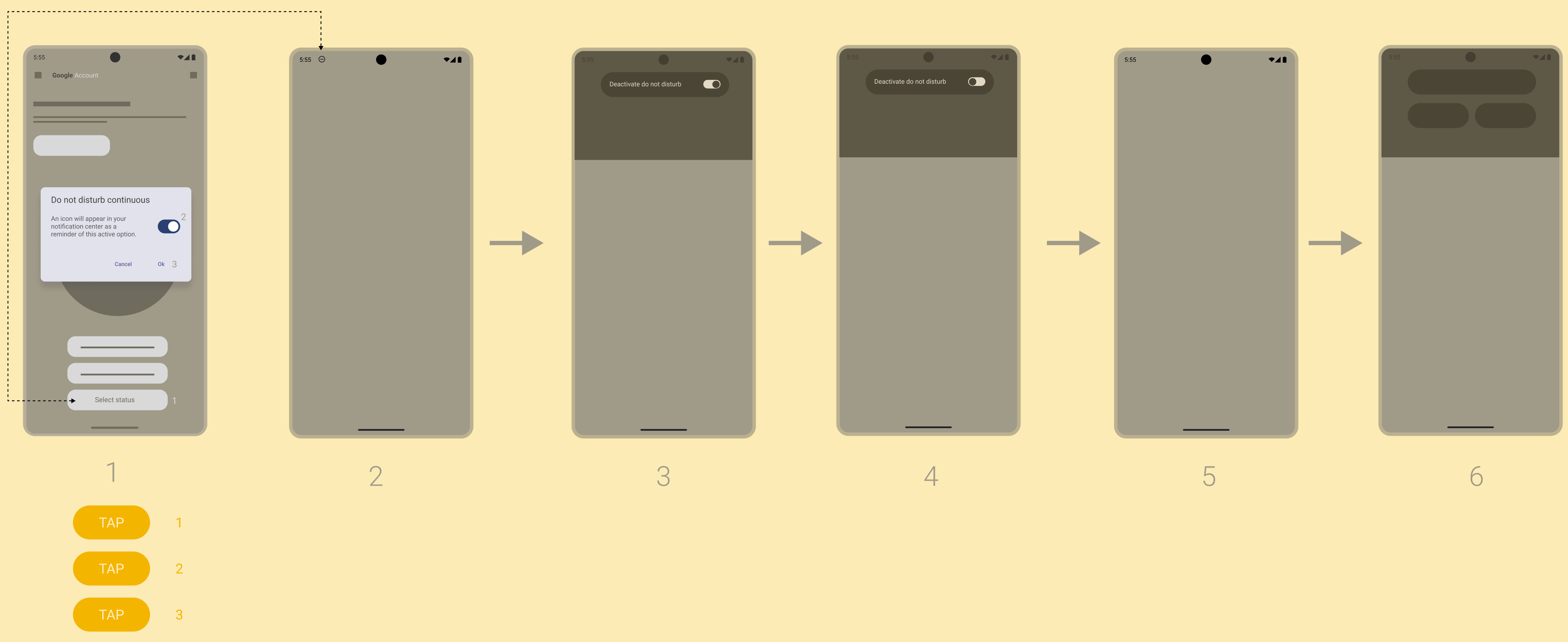
“The possibility to activate and deactivate Do not disturb from the notifications is a good thing.”
Dealing with confusion.
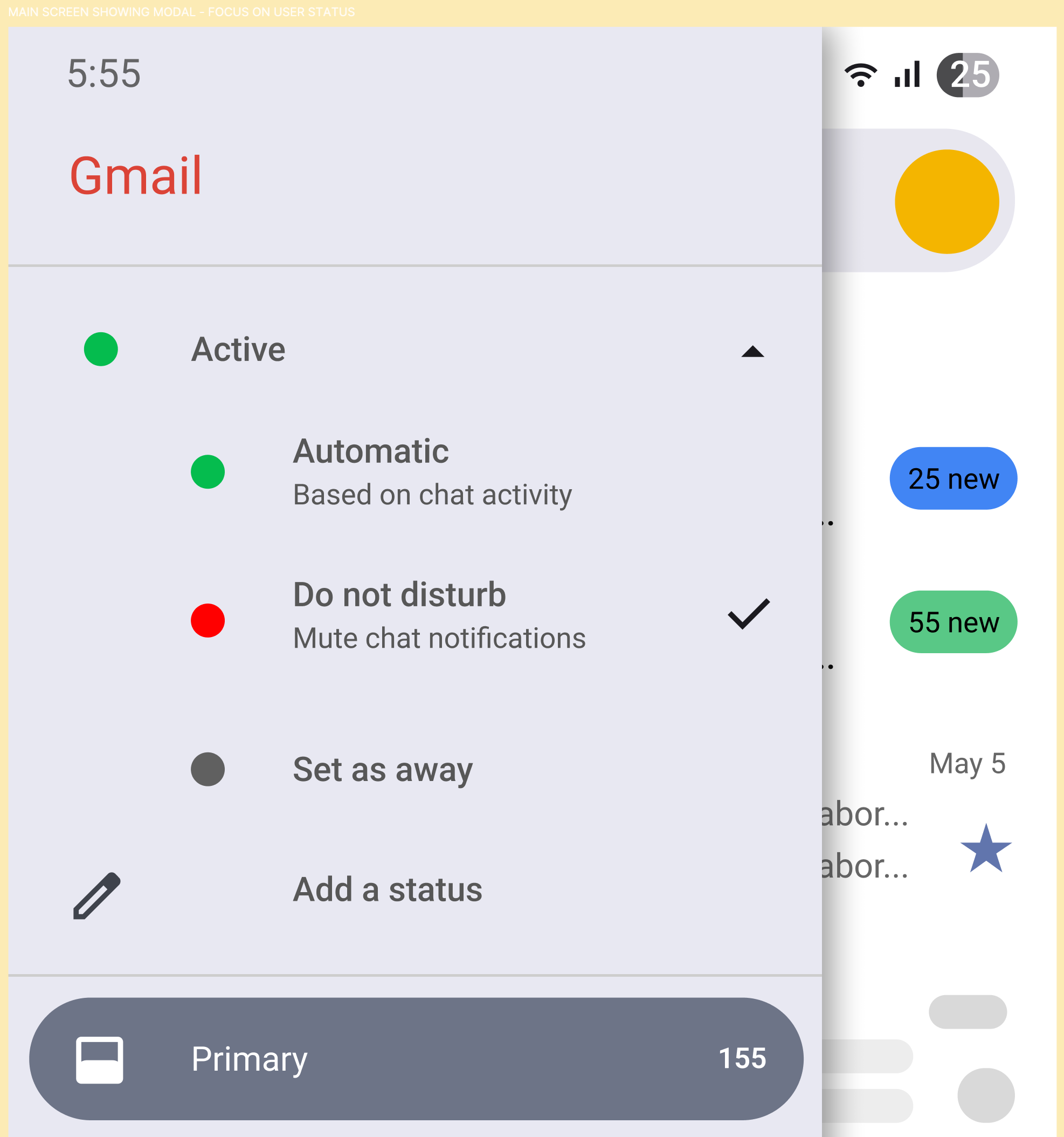
Let’s see how confuse this section is, for example, I can see Active and Automatic both with a green circle, I can see that Automatic it is related with Chat, but what about Active? Active where? same problem with Do not disturb and Set as away and then Add a status, all of this could make users confuse because it is hard to tell where all of this is applicable to.
Also, Active, Automatic, Do not disturb and Set as away are all status, right? and then the App is asking me to Add a status? The first idea that comes to mind is that these status affects my ability to receive or send email, that this status will pop up when one of my contacts try to send me an email.
Less options, but more freedom.
It is this enough? I think yes, because this approach reduce in 90% the cognitive load, why? well let’s see.
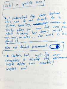
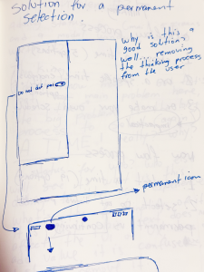
1. Toggle Do not disturb continuous [could exist a better name] 2. An icon will appear during the status on my Notification Center (this is important for few reasons: 1. The user don’t have to think in dates and hours, the icon will be there as long as the user wants, 2 weeks, or 4 days, when the status finishes just tap to deactivate)
Again, it is this enough? Well, Deactivate do not disturb it is not very descriptive, that part needs more love. Also this idea of the user scheduling a status is rounding my head, more research is necessary, personally I do not see users using this, but I could be wrong.
– “Users actually needs a schedule“ Yes, for example if a user toggle Do not disturb continuous on Mon Jun 23 8:23 AM and deactivate it on Friday Jun 27 5:55 PM, there’s an implicit schedule, taking away from the user the cognitive load to think about date and time.
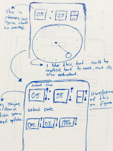
– “Users wants control and options” Yes, there’s a lot of options and control in this simple toggle, the user will decide when to start and when to finish, and just with this simple action, a lot is happening. For example: Let’s image this student entering to the math class, [5:25 PM to 6:25 PM] the class should be less or more than a hour, (less or more than a hour it is a lot to think about it) but the user just select Do not disturb continuous and now instead of thinking if he choose the correct time to automatically deactivate his status, he has the control to decide when. If does not matter if the class is 25 minutes or 3 hours, the user will have that icon on the Notification Center as a reminder to deactivate the continuous status.
5
All settings, old flow.
This is a big one.
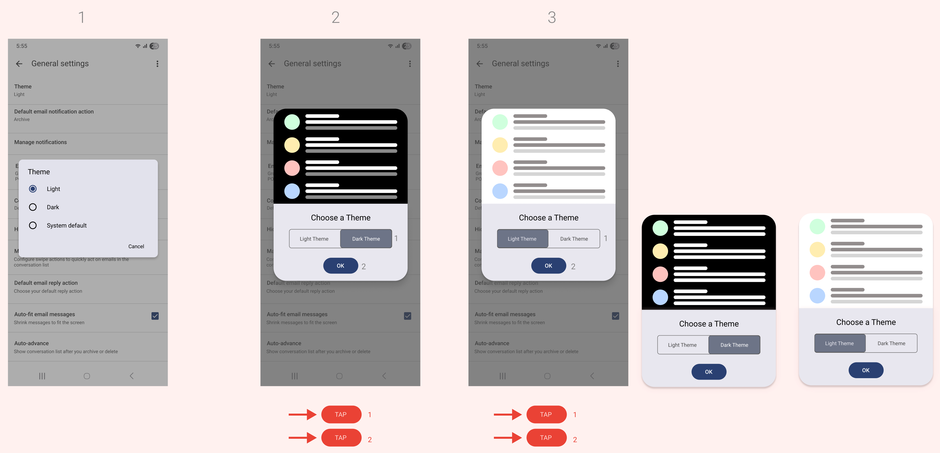
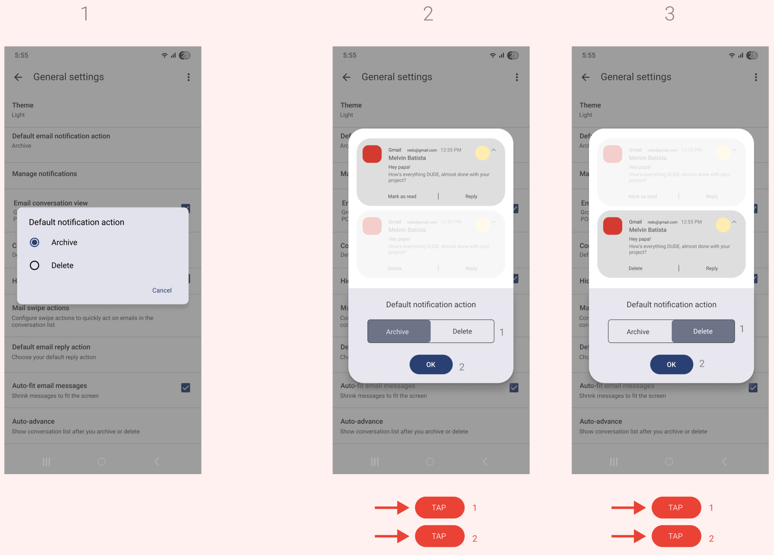
Old design did not add clues about what user options do. See screen #1: Theme, but theme what? no very descriptive, then Dark and Light, but not on what it will apply, then System default, it is just redundant, because there is only two options color, is one or another.
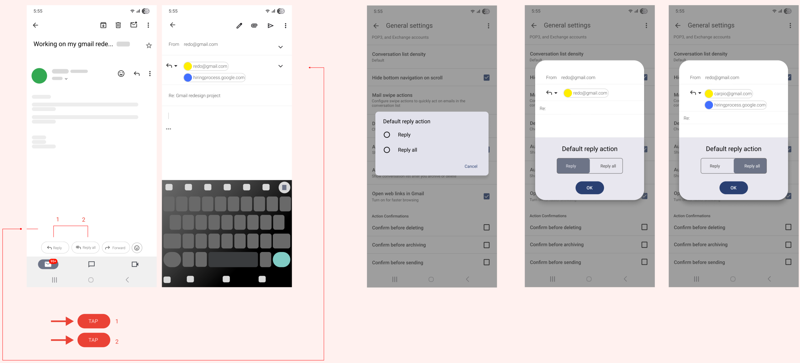
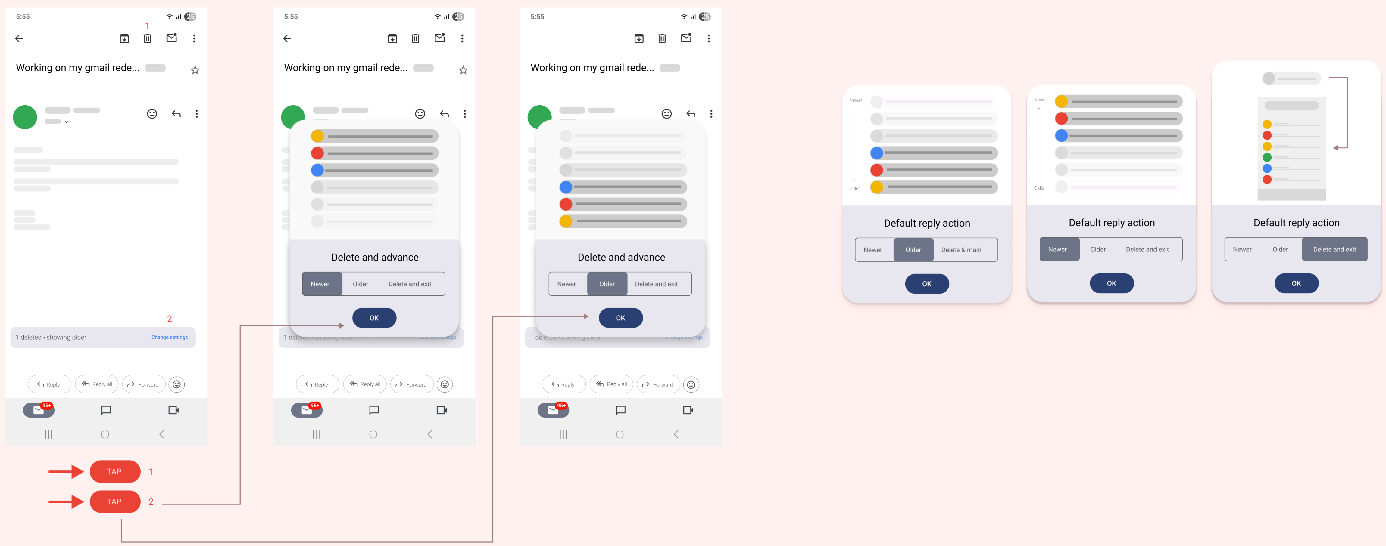
In Gmail, the default reply action (whether to reply to just the sender or to all recipients) can be changed in the settings.You can choose to have the default be “reply” (only the sender) or “reply all” (all recipients).

6
“Gmail should be personal.”
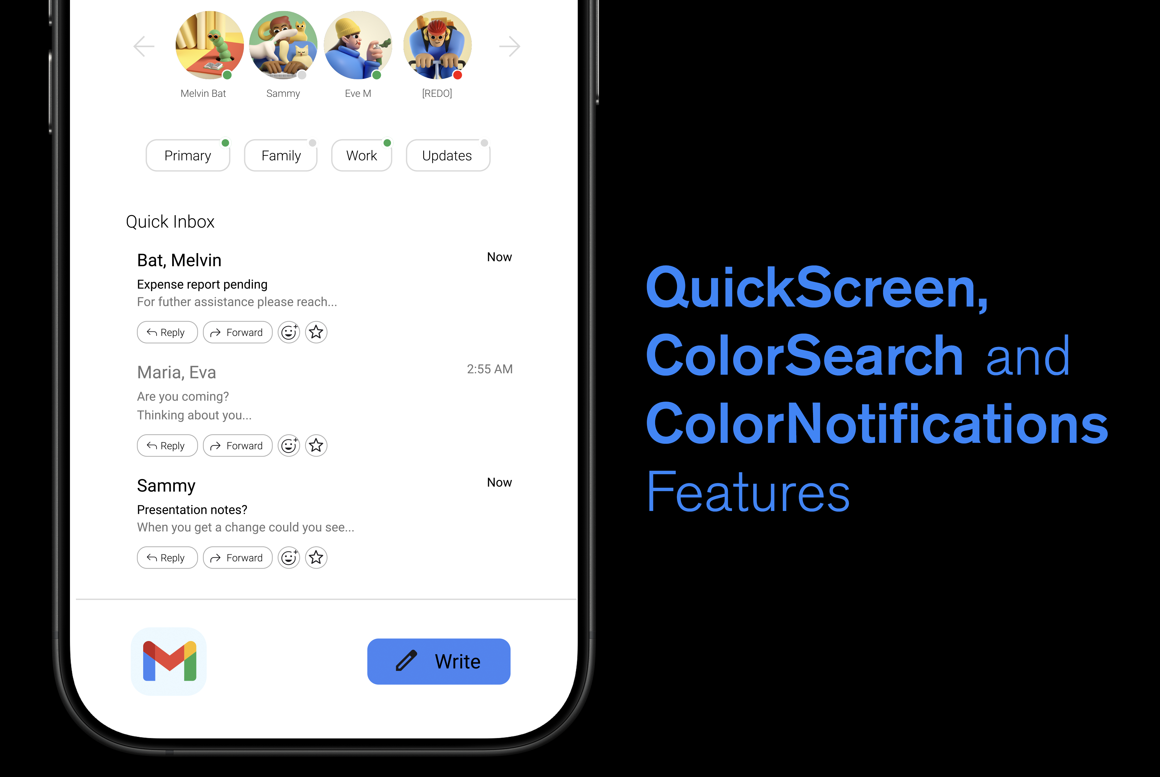
“This is a work in progress, right now I’m focus on learning After Effects, and thinking about this redesign, feel free to come back later to see the updates.”

